Today is December 7th, affectionately known as Delaware Day in commemoration of the day Delaware became the first state to ratify the United States Constitution. It is a day to look back at Delaware’s 236 years of history with an unbiased eye, and to discuss what kind of state we are building for the future.
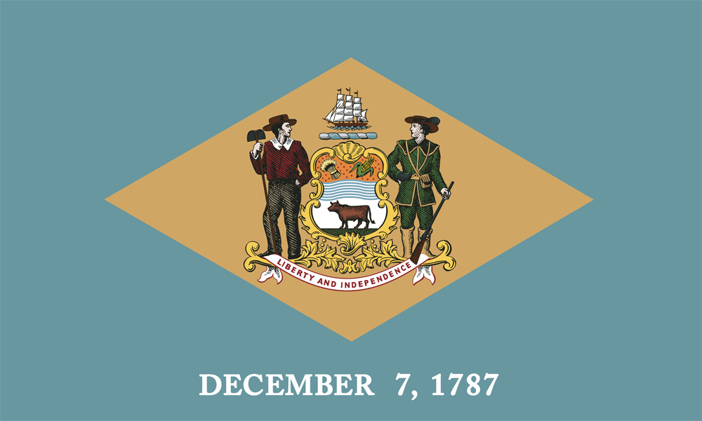
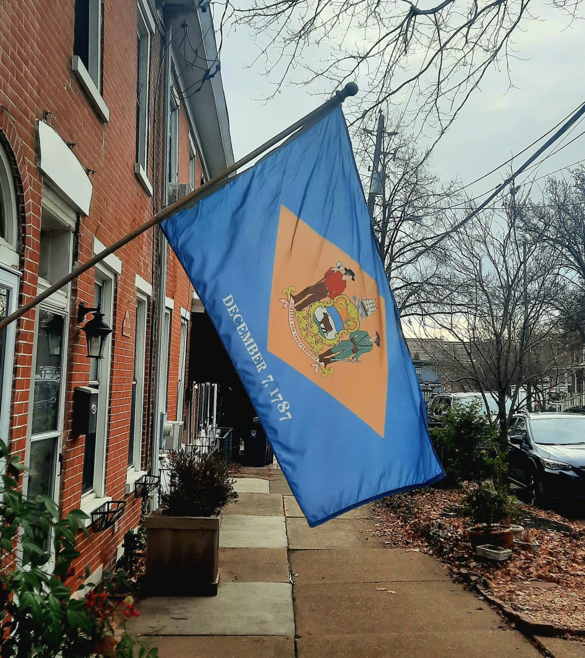
As we reckon with Delaware Day, there’s perhaps no better place to start than the state flag. It even has the date “DECEMBER 7, 1787” emblazoned right on it, just as was codified back in the 1950s. The flag is a field of “colonial blue,” a diamond of “buff,” with the state’s coat of arms dropped smack in the middle. The coat of arms itself is a treasure trove of on-the-nose symbolism that represents and glorifies a Delaware many of us would find unfamiliar. It’s a mishmash of nods to an agricultural past, a celebration of white land-owners and “citizen-soldiers.”

Viewing the flag through a designer’s eyes, one can’t help but notice that the Delaware state flag is what vexillologists (those who study flags) refer to as an “SOB” (a seal on a bedsheet). (In case the acronym didn’t give it away, this is not a term of endearment.) Depending on how strictly you apply the term, roughly half of American state flags could be considered SOBs. Delaware’s state flag has two strikes against it solely because of its use of the SOB patten, according to the North American Vexillological Association’s Five Principles for Great Flags (“No Lettering or Seals” and “Be Distinctive”). I’d argue it doesn’t satisfy any of the remaining three principles, either.
Because it is a visual representation of the Delaware Way’s prized “consensus,” rather than choosing a single meaningful idea to express, it fails the “Keep It Simple” principle. While the flag is comprised of two main colors, it fails the principle of “Use 2 or 3 Colors” due to the many other colors in the detail of the seal.
Which brings us to the principle of “Use Meaningful Symbolism.” Taking a closer look at the symbols represented on the flag’s seal, we have… two white dudes, one of whom is holding a gun. A bunch of items meant to represent historical economic drivers of the state (wheat, corn, ox, ships on a river). And a date, but no reference to what (or more specifically, who) was here before.
A state flag is “a visual manifestation of a state’s values in the same way that a logo represents what a company cares about,” in the words of Elizabeth Goodspeed, an influential designer, instructor and teacher. With this context, I ask: is this the banner we want to represent our state’s values? One that resoundingly fails all the accepted criteria of what makes a state flag good? One that celebrates our state’s role in the displacement and genocide of tens of thousands of indigenous people? One that, in the professional opinion of this author, is just plain ugly?
I believe we can do better. We’re not stuck with the flag we have today. Many other states have recently redesigned their flags recently or are in the process of doing so. Regardless of the aesthetic or semantic motivation behind these changes, these states and others managed to come together and forge a new path. As such, when the General Assembly reconvenes next month, I call on Delaware lawmakers to join these states by beginning a robust, inclusive process to replace Delaware’s state flag with a new one that we can be proud to fly in our state houses, homes and schools.

