Let’s deal with the elephant in the room right up front: Sarah McBride’s and Colleen Davis’s logos sure do look similar, don’t they?
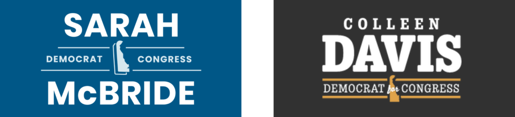
Yeah. Yeah, they do.
For what it’s worth, I don’t actually believe that one copied the other. One of the main goals of your political brand should be to differentiate. It would make no sense to intentionally model your logo after another candidate’s, no matter how popular she is. And different designers totally unaware of each other, given the same challenge, will often land in the same place. It happens all the time, I promise.
But the thing is, you don’t get to offer an explanation for your logo. It must stand alone and covey meaning without and the benefit of context. That’s… kind of the point of it. (This is one of the other reasons Eugene Young’s logo is such a triumph: it differentiates him from the pack. More on that in a moment.)
Now that we’ve acknowledged their similarity, let’s discuss their differences.
Typographically, McBride goes bold, almost bludgeoning the viewer with her name. To me, it’s speaking to the absolute force she’s become in Delaware politics over the past half-decade or so. Davis chooses an interesting typographical approach by using a soft, serifed face that’s evocative of a retro typewriter. I find Davis’s approach more interesting, but almost distracting. Is she implying she’ll take a more conservative approach to governance than McBride’s bold, modern typography would suggest?
Each candidate incorporated the Delaware state outline, with subtle differences. McBride places a stroke behind the state, giving it the impression of depth and dimension, while Davis jams the state in and superimposes the word “for” on it in script. Overall, this contributes to the tightly-packed feel of Davis’s logo. It has no room to breathe, furthering the subtle suggestion of conservatism I’m getting from her typographic choices.
One place where Davis does not go conservative here is her color palette, which seems to be an attempt to shift and modernize the traditional colonial blue and gold palette that is so strongly associated with Delaware. It’s a nice update that stands in contrast to the rest of the subtle communication in the design choices here. McBride’s colors, on the other hand, are the two-tone blue approach that immediately strongly signifies “modern Democrat.”
And now, for something completely different. Here’s the logo for Eugene Young’s candidacy.
To describe it in one word: Bravo! THIS is a logo, folks.
The state outline used in a tasteful way, with three stripes jutting from it. They read as the crossbars of the E, but also evoke both the American flag AND the three counties Eugene seeks to represent. Honestly, it’s so well done, I smile every time I see it.
The rest of the logo does not try to do too much, nor does it squander the beauty of the E mark. The typography is a nice, tasteful Gothic font, well kerned. I really appreciate the vibrancy of the color palette, too, suggesting the energy and progressiveness of the candidate.
Admittedly, I do have some concerns about the Rehoboth and Indian River Bays will reproduce across many different media. (Curiously, of the three candidates, Young’s logo adds the most depth and detail to the bays. McBride’s logo greatly simplifies them, while Davis, who grew up in Sussex County and lives there currently, opted to omit them entirely. I wonder if any eagle-eyed potential voters will notice this and feel slighted?)
All in all, that’s a small quibble. Young’s mark, overall, is a triumph. It stands on its own, and is perfectly understandable without “getting” the layers of meaning folded into the flag stripes. The additional semantics are an added treat for sophisticated viewers. This is how it’s done.
Len Damico is a Wilmington-area dad who loves to think, talk and post about design leadership, Delaware leftist politics, Penn State football and ‘90s indie rock, not necessarily in that order.