The first thing you notice about the logo for Matt Meyer’s recently announced bid for Governor of Delaware is the use of the state outline in the open counter of the R in MEYER. It’s a clever application, one I’m pretty sure I’ve never seen before. It works in concert with the color palette of the logo (a navy blue and gold that could have been eye-dropped from the University of Delaware logo) to make it very clear which state Meyer seeks to represent as governor.
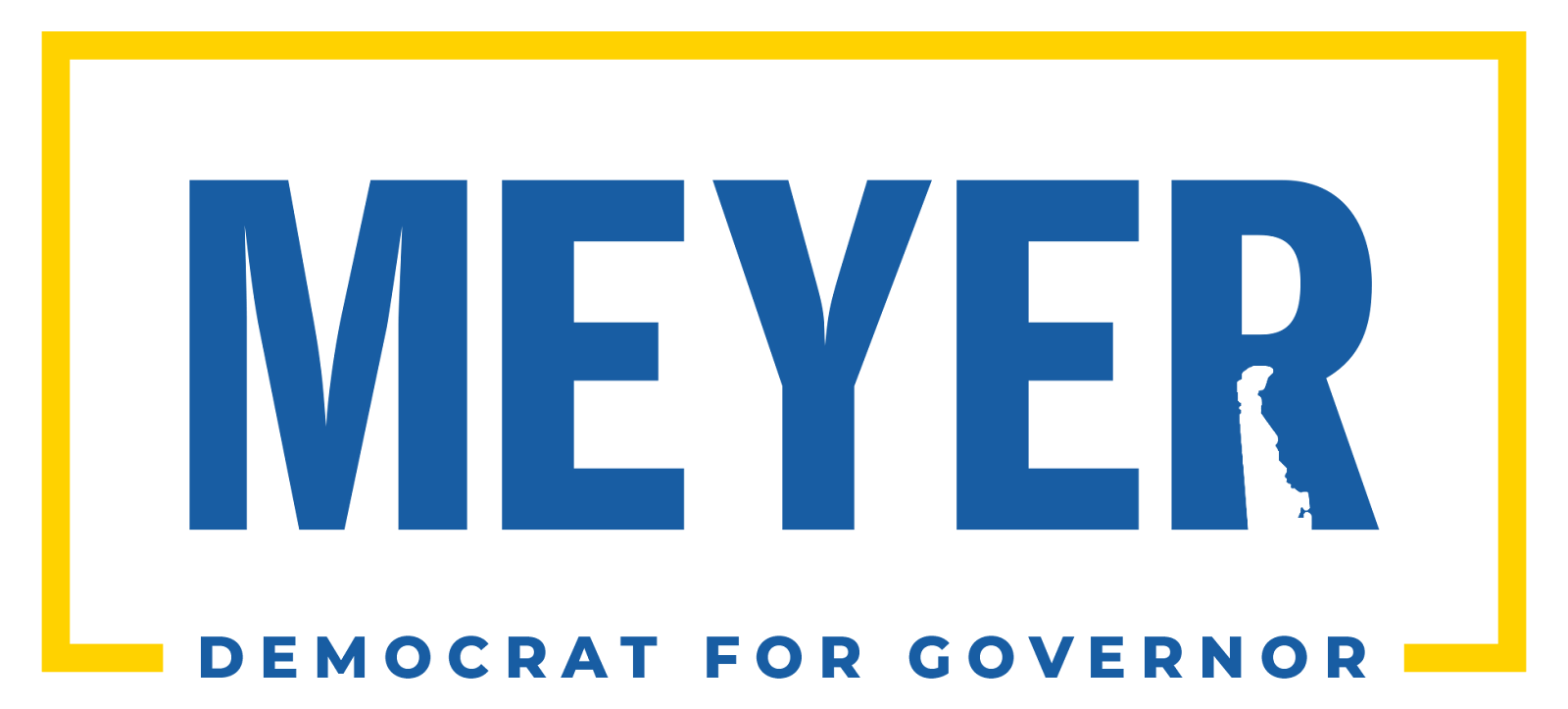
I have some minor aesthetic quibbles with the state outline usage, along with some major functional ones. The logo is overwhelmingly composed of strong, clean lines, with limited fussiness or ornamentation, so the way the state outline is used feels inconsistent and almost too cute. Functionally, I suspect that this treatment will cause problems for mechanical reproduction. The state outline detail looks great and is highly legible in digital applications and when reproduced fairly large (like on lawn signs), but what about when it’s shrunk for a piece of stationery? How will it reproduce on t-shirts or when embroidered? I worry that the detail will be lost and the R will merely look like the result of a printing error.
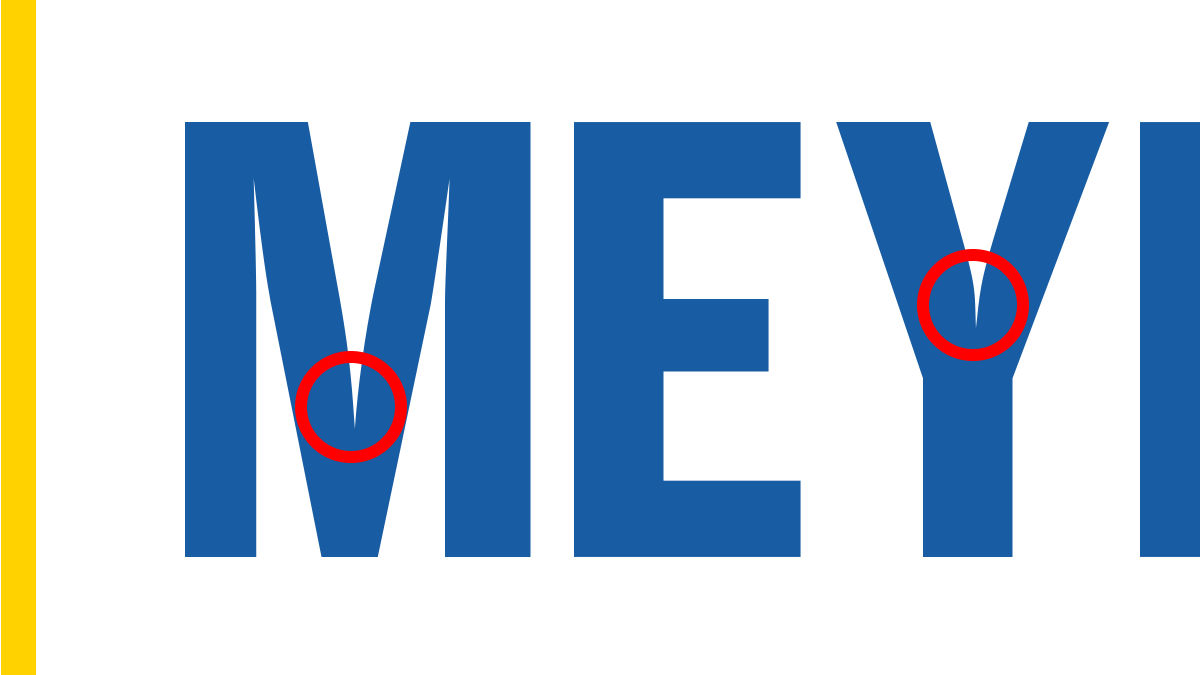
Speaking of reproduction, using a font with such pronounced ink traps (the areas in the crotch of the M and Y characters) for the candidate’s name is a curious decision. You generally need ink traps when you’re printing in small sizes or on a flimsy substrate like newsprint. I know they are making a comeback as an aesthetic choice but I find them distracting here. I generally like the letterforms, but would have loved it if the designer converted the characters to outlines and removed the ink traps (and if they wanted to tighten the kerning around the Y while they’re at it I wouldn’t object).
Rounding out the logo is the slogan “DEMOCRAT FOR GOVERNOR” below the candidate’s name, knocking out the gold framing rectangle that encompasses the rest of the logo. It’s a fine face, something fairly modern and appropriate.
Stepping back and evaluating the logo in total, it’s… fine. It’s reminiscent of a license plate for me, which feels random, given that Meyer’s life prior to public office found him serving as a diplomat in Iraq and a teacher in Wilmington. Not that I’m looking for camo or pencils and chalkboards, but it’s odd to me that none of those very interesting and relevant life experiences are evoked in his branding. A charitable take would be that it’s safe, sturdy, dependable. Something all Delawareans can get behind without worrying about offending anyone.
A less charitable critique would call it boring. Which is a shame, because there’s been nothing particularly boring about the policies Meyer has advocated for and enacted as New County Castle executive. To pick just one accomplishment, the Hope Center, a hotel turned homeless shelter opened in December 2020, was creative and ambitious, especially for a county official. There’s nothing that suggests that kind of creativity or ambition in this logo.
Meyer had an opportunity, as the first candidate to officially announce, to stake his claim as a bold, progressive choice; this logo does not attempt to do that. I am hopeful that Meyer’s branding is not notice of the type of campaign Meyer will run, or the type of governor he’d be if elected.
Len Damico is a Wilmington-area dad who loves to think, talk and post about design leadership, Delaware leftist politics, Penn State football and ‘90s indie rock, not necessarily in that order.